Help Wanted
The Buckhannon-Upshur Chamber of Commerce is hiring an Executive Director to lead the organization and support local businesses, events, and economic growth across Upshur County. Salary runs $37,440–$41,600, and applications are reviewed on a rolling basis until the position is filled. Read more →
This story brought to you paywall-free, courtesy of the My Buckhannon team and our community partners
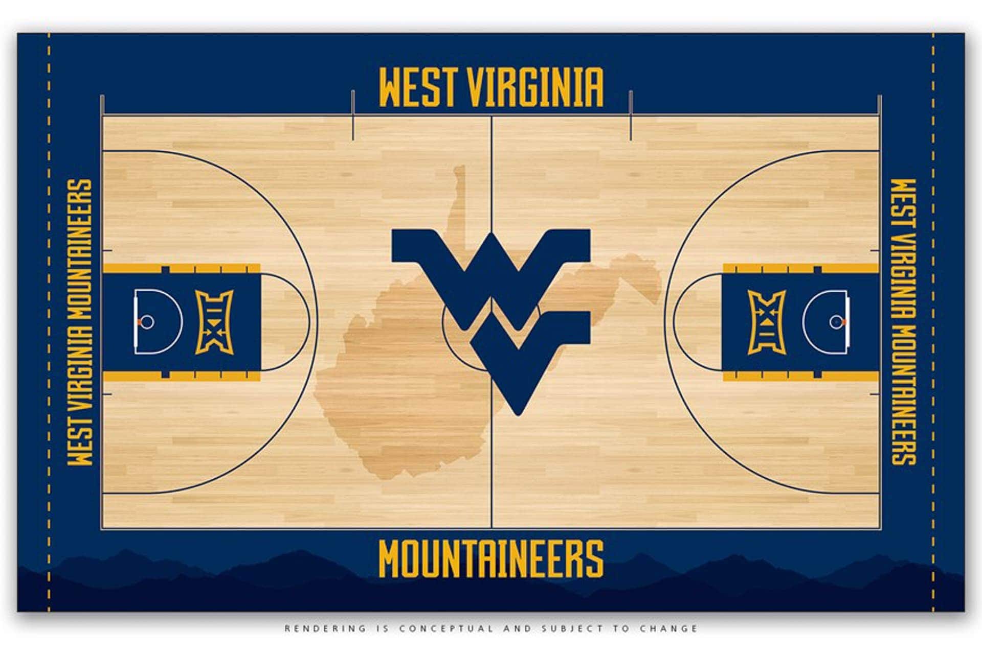
MORGANTOWN, W.Va. – A “clean” and “classy” look is what West Virginia University director of athletics Shane Lyons was seeking with a new Coliseum court design, and that’s exactly what WVU’s 49-year-old arena will be getting later this summer.
A small group consisting of Lyons, deputy director of athletics Keli Zinn, executive senior associate director of athletics Steve Uryasz, senior associate athletics director Michael Fragale and associate athletics director April Messerly sifted through a dozen or so different designs developed by athletics’ graphic designer Kristin Coldsnow, with assistance from publications director Joe Swan and Fragale.
A dozen quickly became a half dozen to a few until a final design was selected, which is being unveiled today.
“We looked at a number of different things but the one thing we wanted to accentuate was the Flying WV, which we’ve done with this design,” Lyons said. “And then shadowing into that is the state, of which we’re very proud.
![[KELLEY] [2019-11-16] Here For What Matters](https://res.cloudinary.com/mytown/image/upload/f_auto,q_auto,c_limit,w_540/spotlights/qbew6mqjimibs7d3pqe0)
“The one thing we didn’t want was a floor with a complicated design,” he added. “We wanted it to be a very clean, classy look as opposed to it being too busy.”
Clean and classy have been synonymous with the Coliseum floor looks throughout its history.
21776This will be the sixth different floor design the facility has had since it opened in 1970. The first, which lasted 20 years, prominently featured the letters WVU running diagonally through the middle of the state at the center jump circle with West Virginia painted in white along the baselines.
The color scheme was predominantly blue with a white outline.
![[DHS] [2025-05-23] Womens Care](https://res.cloudinary.com/mytown/image/upload/f_auto,q_auto,c_limit,w_540/spotlights/jjwwotspedh9lajufu2o)
The second design, which saw the introduction of the script West Virginia, the addition of the Flying WV in a gold jump circle and the removal of the state outline, lasted just one year before transitioning to a third design in 1992. The Flying WV and script West Virginia logos remained, and the blue outline of the state returned, making them the defining elements of this design.
The baselines featured gold “Mountaineers” in white trim and “Atlantic 10” painted in white in front of the two free throw lines.
Once again, the floor’s predominant color was blue.
The fourth design during the years 2001-08 was probably the Coliseum’s most elaborate, with gold basketballs painted in the middle of the two free throw lines and the lane areas shaded in blue. The Flying WV in blue was placed in the center jump circle and “Big East” logos were located just outside of the 3-point lines before moving into the lanes in a later iteration.
![[DHS] [2025-05-23] Primary Care](https://res.cloudinary.com/mytown/image/upload/f_auto,q_auto,c_limit,w_540/spotlights/uxjgdvofnhnwtmbb9ap7)
“Mountaineers” in gold was painted along the sidelines and the script West Virginia was placed on the baselines. There was more gold in this look than the prior three designs.
The most recent Coliseum floor design featured even more gold, with a blue Flying WV at the center jump circle and the Big 12 logos painted in blue in the lane area. “Mountaineers” in gold remained along the sidelines and newer, white versions of West Virginia outlined in blue were placed on gold baselines.
“I looked at our floor and thought over the last couple of years, seeing games on TV, our floor started looking dated,” Lyons said. “They went to lighter floors then and the light kind of bounces off of it and ours has that yellowish tint that looked dated a little bit.”
Lyons said he considered redesigning the floor last year, but he decided to delay it until the new Nike rebranding process was completed earlier this spring.
![[HANK] [2026-01-23] Rate Lock](https://res.cloudinary.com/mytown/image/upload/f_auto,q_auto,c_limit,w_540/spotlights/dmqkcxthbuh8978vmbue)
“It went hand in hand with the Nike branding,” he explained. “The floor has to be recoated each year so now was the time to redo it.”
21777The new design brings back blue as the predominant floor color with a large Flying WV in the center of the court behind a shadow of the state. “West Virginia Mountaineers” is displayed in gold along the two baselines with “West Virginia” painted along the bench sideline and “Mountaineers” painted along the student section side of the arena.
The lane area is once again blue (trimmed in gold for the first time) with the Big 12 logos also outlined in gold. The wordmarks are the new ones established during the Nike rebranding process.
Additionally, a silhouette of mountains will appear along the sideline in front of the student section, but it will be difficult to see on game day because the lighting and courtside seating will obscure it.
![[STJ] [2026-05-18] Same Day Appointments](https://res.cloudinary.com/mytown/image/upload/f_auto,q_auto,c_limit,w_540/spotlights/glc2vptrxpjje75iyedp)
Overall, the look is clean, crisp and sharp.
“We wanted ‘Mountaineers’ on both ends, the conference logo and picking up the gold and blue in the lanes,” Lyons noted.
Once the committee pared down the design, Lyons took it to coaches Bob Huggins, Mike Carey and Reed Sunahara to get their opinions.
What did they like?
![[FETC] [2025-08-23] Earn a CDL 2](https://res.cloudinary.com/mytown/image/upload/f_auto,q_auto,c_limit,w_540/spotlights/chkiaoujerahxlckcnql)
What was missing?
“Their responses were it was clean and classy,” Lyons said. “They liked the tone of it, which is a lighter looking floor, and we think that will make it pop a lot more on TV.”
Ledford Sports Floors has been contracted to paint the floor, scheduled to begin on Monday, June 10. Work should take approximately a month.
There could be some slight modifications based on the distance of the men’s and women’s 3-point lines, which will be determined early this summer.
![[AGING] [2024-12-13] In-Home Services](https://res.cloudinary.com/mytown/image/upload/f_auto,q_auto,c_limit,w_540/spotlights/ropbl44m1kd43zhrw1fu)
“I don’t want the 3-point lines touching the silhouette of the state,” Lyons said.
“Everybody has different tastes. That’s why when you go into a clothing store you have different types of clothes. There are different types of cars. Everybody has different opinions, but from what we are trying to do with our uniforms with a clean, sleek, classy look, this goes right with it,” Lyons concluded.
![[STJ] [2026-06-11] Healthy Hero Hustle 5K](https://res.cloudinary.com/mytown/image/upload/f_auto,q_auto,c_limit,w_540/spotlights/loal8iauj2klyxn7yh6w)