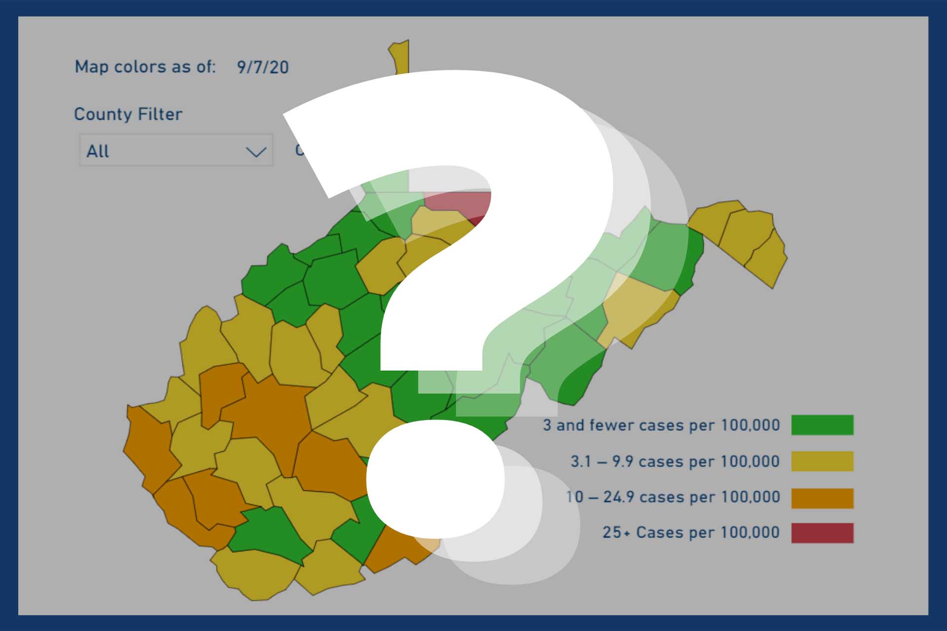
With the recent COVID-19 outbreak in Upshur County, many residents are trying to figure out just how the state’s color-coded alert map works. If you left your calculator at home or just don’t feel like tabulating the seven-day rolling average normalized to a population of 100,000, here’s the My Buckhannon cheat sheet for Upshur County:
First, add up the number of new cases in Upshur County over the past seven days. Then use this chart:
- Green: 0-5 cases
- Yellow: 6-16 cases
- Orange: 17-42 cases
- Red: 43+ cases
Now, here’s what the colors mean in practical terms:
- Green: Doing well.
- Yellow: Still OK, but try to improve.
- Orange: Warning level. No sports competitions, but practices are allowed.
- Red: Danger zone. In-person school and sports immediately cease.
One last tidbit that could be relevant to Upshur County: The orange level for sports only matters for the map released Saturday at 9 p.m. If you are orange at that time, no games can be played for the whole week. Conversely, if you’re yellow or green, games are good for the whole week.
So, for example:
- If you are yellow on Saturday, but turn orange on Tuesday, you won’t miss any games that whole week.
- But if you’re orange on Saturday, then go yellow on Tuesday, you will still miss the entire week. The Saturday map sets the schedule for the full seven-day period.
Hope this little cheat sheet helps. Any questions, please reach out!
The fine print: Long-term care outbreaks are excluded from the color-coding calculations. That has not been an issue in Upshur County, but we’ll track that data locally and let you know if it ever alters the formula outlined above.